

In today’s digital age, we generate more data than ever. Everything is captured and stored, from how we shop to communicate. But what good is all of this data if we need help to make sense of it? This is where the power of data visualization comes in. With the help of cutting-edge IT tools and techniques, we can turn raw data into powerful insights that can drive business decisions, identify patterns, and even predict future trends.
This article will explore the world of data visualization and its impact on information technology. We’ll take a deep dive into the various types of visualizations, the tools used to create them, and the best practices to make the most of this powerful tool. So, get ready to unleash the power of data and take your IT game to the next level.
What is Data Visualization?
Data visualization is the graphical representation of data and information. It involves transforming raw data into visual objects such as charts, graphs, maps, and infographics to make it easier to understand and interpret.
By presenting data visually, it is possible to identify patterns, relationships, and trends that might take time to be apparent when looking at the raw data. This is because our brains are wired to process visual information more quickly and efficiently than text or numerical data alone. It can help simplify complex information, making it more accessible to a broader audience and enabling individuals to gain insights and make informed decisions.
It is used in various fields, including business, science, engineering, and journalism. It plays a crucial role in data analysis and communication. It is essential for making sense of the vast amounts of data generated by modern technologies such as the Internet of Things (IoT) and big data analytics.
Tools and Techniques for Data Visualization
Effective visualization requires technical skills, creativity, and an understanding of the underlying data and the audience. By choosing the right tools and techniques, data visualization can be a powerful tool for turning raw data into meaningful insights that can inform decision-making and drive business success. There are many tools and techniques available for it. Here are some of the most popular ones:
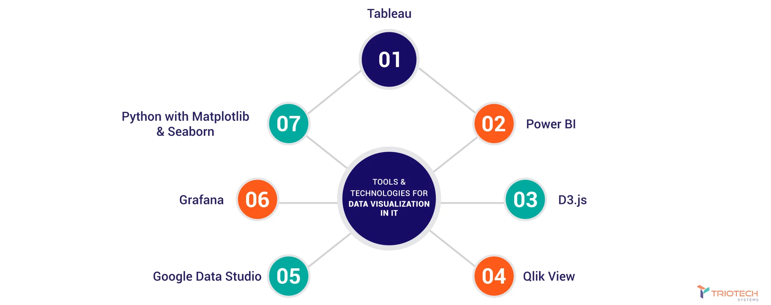
Data Visualization Tools: Many tools are available for creating data visuals, including Tableau, Power BI, Google Data Studio, D3.js, etc. These tools provide an easy-to-use interface for creating various visualizations, allowing users to connect to different data sources and build interactive dashboards and reports.
Data Pre-processing: Before creating data visuals, it’s crucial to pre-process the data to clean and prepare it for visualization. This may include removing duplicates, filling in missing values, or aggregating data at different levels.
Storytelling: It is not just about presenting data; it’s also about telling a story with the data. This requires carefully selecting the correct type of visualization, creating a narrative flow, and choosing the right level of detail to convey the key message.
Design Principles: Good design is crucial for effective data visualization. This includes using appropriate colors, fonts, and layouts and avoiding clutter and unnecessary details distracting from the message.
Interactive Features: Interactive data visualizations can be more engaging and help users explore data more deeply. This may include features such as tooltips, filters, and zooming in and out of charts and graphs.
Data Integration: Data visualization is often used with other data analysis techniques, such as data mining and machine learning. This requires integrating data from different sources and using algorithms to discover patterns and insights.
Best Practices for Data Visualization
Creating compelling data visualizations is not just about creating pretty pictures; it’s about presenting complex information in a way that can be easily understood and acted upon. To do this, there are several best practices that data analysts and visualization designers should follow.
Understand Your Audience
One of the most important best practices is to understand your audience. It’s essential to design visualizations with the intended audience in mind, considering their background, knowledge, and interests. For example, a chart intended for a technical audience may include more detailed information and terminology than one intended for a non-technical audience. Understanding your audience helps ensure your visualizations are relevant, useful, and effective.
Keep It Simple
Another key best practice is to keep it simple. Simple visualizations are often more effective than complex ones. Too many colors, shapes, or patterns can distract from the message and make the visualization harder to understand. Focus on the essential data points and use only what is necessary to convey the message. By simplifying the visualizations, you can make them more accessible and easier to comprehend.
Selecting The Mode
Choosing the right type of visualization is also crucial. Many types of charts and graphs are available, and selecting the most appropriate one can make a significant difference in the effectiveness of the visualization. For example, a bar chart may be more effective than a pie chart for comparing data across categories. The chosen visualization should be the one that best represents the data and supports the message you want to convey.
Consistency
Using consistent design elements such as fonts, colors, and scales helps to make the visualizations more cohesive and easy to understand. Consistency also helps maintain the data’s integrity and prevents misleading interpretations. Establishing and sticking to a clear design framework throughout the visualization process is important.
Examples Of Good And Bad Data Visualizations
Examples of good data visualizations include clear and concise charts and graphs that effectively convey the message. For instance, a bar chart with a clear title, labeled axes, and consistent colors can be an excellent way to compare data across different categories. On the other hand, bad data visualizations can be confusing, misleading, or difficult to interpret. Examples of bad data visualizations include unclear or inconsistent labels, overly complex designs, and using inappropriate visualization types. For instance, a pie chart with too many categories can be hard to read and understand, making it less effective in communicating the message.
The Impact of Data Visualization on IT
Data visualization has profoundly impacted the field of IT, transforming how organizations handle and analyze data. With the increasing volume of data generated daily, IT professionals need efficient and effective ways to make sense of it all. It solves this challenge by enabling IT professionals to process and interpret vast amounts of data in a more accessible and meaningful way.
Decision Making
By presenting data visually, IT professionals can quickly identify trends, patterns, and anomalies in the data, helping them make better decisions. For example, data visuals of website traffic can quickly reveal which pages are popular, which pages need improvement, and which pages need to be removed. With this insight, IT professionals can make data-driven decisions that improve the user experience and overall website performance.
Presentation
Data visualization is also changing how IT professionals communicate data to non-technical stakeholders. By presenting data visually, IT professionals can communicate complex information in a way that is more accessible and easier to understand. This helps bridge the gap between IT and other departments, improving collaboration and decision-making across the organization. For example, data visualization of sales data can help the marketing team better understand customer behavior, enabling them to create more targeted and effective campaigns.
Improved Efficiency
Another way that data visualization is changing the IT field is by improving efficiency. With the right tools and techniques, IT professionals can analyze and interpret data faster and more accurately than ever. This saves time and reduces errors, enabling IT professionals to focus on higher-level tasks that drive innovation and growth.
Conclusion
Data visualization software has evolved into a need in today’s data-driven environment. IT experts can distill large data sets into useful information that may aid in making decisions, facilitating collaboration, and boosting productivity.
Best practices for creating it include knowing your audience, keeping things simple, picking the appropriate visualization style, and maintaining a unified aesthetic. This will allow them to produce effective and instructive visualizations, increasing the likelihood that their messages will be taken to heart.
Data from many sources, such as spreadsheets, databases, and APIs, may be consolidated into a single dashboard with the help of TRIOTECH SYSTEMS‘ software solutions for enterprises. Businesses may get a complete picture of their operations due to the streamlined access and data analysis from many divisions and sources.
The potential for data visualization to revolutionize how businesses manage and examine their data is immense. It is already essential in various fields and will only expand as the area develops.
FAQs
How Can Data Visualization Help With Data Analysis?
Data visualization can help with data analysis by allowing analysts to identify patterns and trends in large data sets quickly. By presenting the data in a graphical format, data visualization can make it easier to spot outliers, clusters, and other important data points.
What Are Some Common Mistakes To Avoid When Creating Data Visualizations?
Some common mistakes to avoid when creating data visualizations include using too much data, using the wrong type of visualization for the data, not labeling the axes clearly, and using misleading or inaccurate visuals.
How Can Data Visualization Help With Communication?
Data visualization can help with communication by making complex data easier to understand and interpret. By presenting data in a graphical format, data visualization can highlight key insights and trends, making it easier for stakeholders to understand the implications of the data.
What Are Some Best Practices For Using Color In Data Visualization?
Some best practices for using color in data visualization include using a limited color palette, avoiding bright or neon colors, highlighting important data points, and using color consistently throughout the visualization.
What Are Some Emerging Trends In Data Visualization?
Some emerging trends in data visualization include using augmented reality and virtual reality to present data, using machine learning algorithms to generate data visualizations automatically, and using 3D data visualizations to provide more immersive and interactive experiences.